
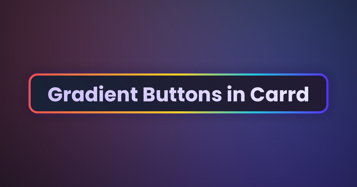
Gradient buttons in Carrd are possible – if you know how. With custom CSS you can use gradients on the button edges, the fill, the label text, the hover state and the focus ring too. Carrd won’t let you do any of this directly in the builder, but it happily runs the CSS through an Embed element. Below you’ll find live, working buttons (complete with hover and tab focus) and the exact code under each one. Apply it to one button or a hundred buttons with a single class name.
Who is this for?
- Anyone who wants buttons with more personality than a single flat color
- Landing pages, portfolios, link-in-bio pages, product pages – a gradient button is an easy way to make the main call-to-action pop
- You need Carrd Pro Standard or higher for the Embed element, and Pro Plus if you want to apply effects via class names – there’s an ID-based fallback for Pro Standard below
How it works (the 10-second version)
Every effect on this page is plain CSS aimed at a Carrd button. Carrd wraps each button group in a <ul> and puts any class you add onto that group – each button inside is a link (<a>). So a snippet aimed at the group’s class can target one specific button, or all of them. Drop the CSS into an Embed element, add the class to your Buttons element, publish. If you want to know more, check out Carrd embed docs.
One small thing up front: Carrd gives its buttons fairly specific styling, so the snippets use !important on the key lines. That’s what guarantees your gradient wins over Carrd’s default button color, so don’t remove it.
Setting it up (do this once)
1. Add the CSS to an Embed element
- In the Carrd builder, click Add Element → Embed.
- Set Type to Code.
- Set Style to Hidden and the location to Head because CSS belongs in the page head.
- Give it a Label like “Gradient Buttons”.
- Paste one (or several) of the snippets below into the Code field. Make sure to include the
<style>and</style>
2. Apply the class to your Buttons element
- Select the Buttons element – the whole button group, not just one button.
- Open its Settings tab → Advanced.
- Under Classes, add the class name of the effect you picked, e.g.
gradient-bg-sunset.
Carrd puts that class on the button group (a <ul>), not on the individual buttons – so each snippet below targets a button inside the group. The selector li:nth-child(1) a means “the first button in this group”. To style a different button, change the number (:nth-child(2) for the second, and so on). To style every button in the group, drop the li:nth-child(1) and just use .gradient-bg-sunset a.
ℹ️ Custom classes need Pro Plus. On Pro Standard, use your button group’s ID instead – you’ll find it in the inspector, it’s something like buttons04. Then replace .gradient-bg-sunset with #buttons04 in the snippet (so the selector reads #buttons04 li:nth-child(1) a) – everything else stays the same.
3. Publish
Embed elements don’t render in the builder preview. Publish and check the live site.
1. Gradient background (the filled look)
The classic gradient buttons in Carrd: a colorful fill that flows from one color to another. Here’s the palette, live:
Each line is one self-contained class. Add as many as you want to the same Embed element and apply different ones to different button groups:
<style>
/* Gradient-background buttons. Add the class to your Buttons element (Carrd puts
   it on the button GROUP); the selector targets the first button in the group. */
.gradient-bg-sunset  li:nth-child(1) a { background-image: linear-gradient(135deg, #ff9a44, #ff5e7e, #a64dff) !important; background-color: transparent !important; color: #fff !important; }
.gradient-bg-ocean   li:nth-child(1) a { background-image: linear-gradient(135deg, #00c6a7, #0072ff)           !important; background-color: transparent !important; color: #fff !important; }
.gradient-bg-neon    li:nth-child(1) a { background-image: linear-gradient(135deg, #00f0ff, #ff00e0)           !important; background-color: transparent !important; color: #fff !important; }
.gradient-bg-gold    li:nth-child(1) a { background-image: linear-gradient(105deg, #bf8b2e, #ffe79e, #d4a437)  !important; background-color: transparent !important; color: #3a2b00 !important; }
.gradient-bg-rainbow li:nth-child(1) a { background-image: linear-gradient(90deg, #ff4e50, #fc913a, #f9d423, #24c6dc, #5433ff) !important; background-color: transparent !important; color: #fff !important; }
</style>
Change the direction by editing the angle (135deg), or roll your own by swapping the hex colors. (Want all buttons in the group filled? Use .gradient-bg-sunset a without the li:nth-child(1).)
2. Gradient border (gradient on the edges only)
This is exactly what the reader asked for: a gradient running around the edge of the button while the center stays a solid color. The trick is to paint two backgrounds – a solid one clipped to the inside (padding-box) and the gradient clipped to the border area (border-box) – over a transparent border.
<style>
/* Gradient-border buttons: the first color is the INNER fill (set it to your
   button's background); the second linear-gradient is the edge. */
.gradient-border-sunset li:nth-child(1) a {
  border: 3px solid transparent !important;
  background:
    linear-gradient(#fff, #fff) padding-box,
    linear-gradient(135deg, #ff9a44, #ff5e7e, #a64dff) border-box !important;
  color: #1a1a1a !important;
}
.gradient-border-ocean li:nth-child(1) a {
  border: 3px solid transparent !important;
  background:
    linear-gradient(#fff, #fff) padding-box,
    linear-gradient(135deg, #00c6a7, #0072ff) border-box !important;
  color: #1a1a1a !important;
}
.gradient-border-rainbow li:nth-child(1) a {
  border: 3px solid transparent !important;
  background:
    linear-gradient(#fff, #fff) padding-box,
    linear-gradient(90deg, #ff4e50, #fc913a, #f9d423, #24c6dc, #5433ff) border-box !important;
  color: #1a1a1a !important;
}
</style>
Two things you’ll want to tweak:
- Inner color. The
linear-gradient(#fff, #fff)line is the solid center. On a dark site, change both#fffvalues to your background color (e.g.#15151f) and the textcolorto#fff. - Thickness. The
3pxinborder: 3px solid transparentcontrols how thick the gradient edge is. Bump it to4pxor5pxfor a chunkier ring.
Border only, transparent center (ghost button)
If you want the gradient edge with the page showing through the middle – the trendy “outline” button – use this version instead. It works over any background, light or dark:
<style>
/* Gradient ring with a see-through center – works on any background */
.gradient-ring li:nth-child(1) a {
  position: relative;
  z-index: 0;
  background: transparent !important;
  border: none !important;
  color: inherit !important;
}
.gradient-ring li:nth-child(1) a::before {
  content: "";
  position: absolute;
  inset: 0;
  border-radius: inherit;
  padding: 3px;                 /* ring thickness */
  background: linear-gradient(135deg, #ff4e50, #fc913a, #f9d423, #24c6dc, #5433ff);
  -webkit-mask: linear-gradient(#fff 0 0) content-box, linear-gradient(#fff 0 0);
  -webkit-mask-composite: xor;
          mask-composite: exclude;
  pointer-events: none;
}
</style>
3. Gradient label (gradient on the text itself)
You can also run the gradient through the text. The trick is the same one we use for gradient headlines: paint the gradient as the background, then clip it to the shape of the letters. Because the gradient fills the letters, the button’s own fill becomes transparent – so a gradient label pairs beautifully with a gradient edge.
The first button is gradient text on its own. The second adds a matching gradient edge. The third (on the dark panel) is the look from the header image at the top: a thin rainbow edge with a soft, subtle gradient on the label. Here’s the code for all three:
<style>
/* a) Gradient TEXT only – clipping the gradient to the letters makes the button's
   own background transparent, so use this on a borderless button. */
.gradient-label-sunset li:nth-child(1) a {
  background-image: linear-gradient(135deg, #ff9a44, #ff5e7e, #a64dff) !important;
  background-color: transparent !important;
  -webkit-background-clip: text !important;
          background-clip: text !important;
  -webkit-text-fill-color: transparent !important;
}

/* b) Gradient text + a matching gradient edge (transparent center) */
.gradient-text-btn li:nth-child(1) a {
  position: relative;
  z-index: 0;
  border: none !important;
  background-image: linear-gradient(90deg, #ff4e50, #fc913a, #f9d423, #24c6dc, #5433ff) !important;
  background-color: transparent !important;
  -webkit-background-clip: text !important;
          background-clip: text !important;
  -webkit-text-fill-color: transparent !important;
}
.gradient-text-btn li:nth-child(1) a::before {
  content: "";
  position: absolute;
  inset: 0;
  border-radius: inherit;
  padding: 3px;                 /* edge thickness */
  background: linear-gradient(90deg, #ff4e50, #fc913a, #f9d423, #24c6dc, #5433ff);
  -webkit-mask: linear-gradient(#fff 0 0) content-box, linear-gradient(#fff 0 0);
  -webkit-mask-composite: xor;
          mask-composite: exclude;
  pointer-events: none;
}

/* c) Subtle label (white → lavender) with a thin rainbow edge – the header look */
.gradient-text-subtle li:nth-child(1) a {
  position: relative;
  z-index: 0;
  border: none !important;
  background-image: linear-gradient(135deg, #ffffff, #c3c9ff 70%, #b9a7ff) !important;
  background-color: transparent !important;
  -webkit-background-clip: text !important;
          background-clip: text !important;
  -webkit-text-fill-color: transparent !important;
}
.gradient-text-subtle li:nth-child(1) a::before {
  content: "";
  position: absolute;
  inset: 0;
  border-radius: inherit;
  padding: 3px;
  background: linear-gradient(92deg, #ff4e50, #fc913a, #f9d423, #24c6dc, #5433ff);
  -webkit-mask: linear-gradient(#fff 0 0) content-box, linear-gradient(#fff 0 0);
  -webkit-mask-composite: xor;
          mask-composite: exclude;
  pointer-events: none;
}
</style>
⚠️ One gotcha: keep the gradient on background-image (not the background shorthand). With !important, the shorthand resets background-clip back to its default and your text turns into a solid block. The longhand version above avoids that.
4. Hover effects
A gradient button feels much nicer with a little reaction on hover. Hover the ones below to see it (they’re live):
Three different feels – pick one:
<style>
/* a) Brighten and lift on hover */
.gradient-hover li:nth-child(1) a {
  background-image: linear-gradient(135deg, #ff9a44, #ff5e7e, #a64dff) !important;
  background-color: transparent !important;
  color: #fff !important;
  transition: filter .25s ease, transform .15s ease, box-shadow .25s ease;
}
.gradient-hover li:nth-child(1) a:hover {
  filter: brightness(1.12) saturate(1.08);
  transform: translateY(-2px);
  box-shadow: 0 12px 26px -10px rgba(166, 77, 255, .65);
}

/* b) Slide the gradient across on hover */
.gradient-hover-slide li:nth-child(1) a {
  background-image: linear-gradient(90deg, #ff4e50, #fc913a, #f9d423, #24c6dc, #5433ff) !important;
  background-size: 220% 100% !important;
  background-position: 0 50%;
  background-color: transparent !important;
  color: #fff !important;
  transition: background-position .55s ease;
}
.gradient-hover-slide li:nth-child(1) a:hover { background-position: 100% 50%; }

/* c) Start solid, flood with gradient on hover (the last color is the resting fill) */
.gradient-hover-fill li:nth-child(1) a {
  background: linear-gradient(135deg, #00c6a7, #0072ff) no-repeat left / 0% 100%, #2a2f63 !important;
  color: #fff !important;
  transition: background-size .35s ease;
}
.gradient-hover-fill li:nth-child(1) a:hover { background-size: 100% 100% !important; }
</style>
5. Gradient focus ring (for keyboard users)
When someone tabs to your button with the keyboard, they should see where they are. The default outline is fine but plain – here’s a soft two-tone gradient ring instead. Click into the demo area and press Tab to land on the button and see it:
<style>
/* Gradient-style focus ring – the first shadow color should match your page
   background so there's a clean gap before the ring. */
.gradient-focus li:nth-child(1) a { outline: none; }
.gradient-focus li:nth-child(1) a:focus-visible {
  box-shadow:
    0 0 0 3px #ffffff,   /* gap, set to your page background */
    0 0 0 6px #ff5e7e,
    0 0 0 9px #a64dff;
}
</style>
This only shows for keyboard navigation (:focus-visible), so mouse clicks stay clean – and you keep your site accessible, which a plain outline: none would quietly break.
Bonus: animated gradient
Oversize the gradient and drift it back and forth for a button that subtly shifts color on its own:
<style>
/* Animated gradient button – add class "gradient-animated" to the button group */
.gradient-animated li:nth-child(1) a {
  background-image: linear-gradient(-45deg, #ff4e50, #fc913a, #f9d423, #24c6dc, #5433ff) !important;
  background-size: 300% 300% !important;
  background-color: transparent !important;
  color: #fff !important;
  animation: gb-move 6s ease infinite alternate;
}
@keyframes gb-move {
  from { background-position: 0% 50%; }
  to   { background-position: 100% 50%; }
}
</style>
Gradient buttons in Carrd – The pros and cons
Pros
- Free, pure CSS, no external libraries (only the animated one moves, and that’s optional)
- One Embed element can hold every style; apply different classes to different button groups
- Works with any font and button size – change the look by editing the hex colors
Cons
- Needs Carrd Pro Standard or higher (Pro Plus for the class-based setup)
- The snippets use
!importantto beat Carrd’s button styles, so you can’t then override them again from the builder – set the look in the CSS - Doesn’t display in the builder preview, only on the published site
TL;DR
Add an Embed element (Type: Code, Style: Hidden, location: Head), paste the snippet for the effect you want – gradient background, gradient border, gradient label, hover, focus ring or animated – then add the matching class to your Buttons element under Settings → Advanced → Classes (Pro Plus) or swap the selector for the group’s ID (Pro Standard). The class sits on the button group, so the snippet targets a button inside it with li:nth-child(1) a. Publish. Keep the !important flags.
Want the same trick on your headlines? See Gradient Text in Carrd. For more playful type, there’s our wobbly headline text plugin. And if classes are new to you, start with Carrd element styles.
Check out more tips and tricks on our Carrd Blog.