Today’s Carrd quick tip is about hiding an element in your Carrd site. There are three separate options. One is to completely exclude an element from the published page. You will only see it in carrd.co editor. The others will make an element invisible by hiding the element for specific users or screen sizes.
Why hide an element?
There are a couple of reasons you might want to hide an element in your Carrd site temporarily or even permanently.
Responsive design – this is the top reason to show and hide elements. While Carrd has great defaults and some customisation for making your site responsive it sometimes doesn’t quite cut it. Use visibility control to show and hide an element based on whether a visitor is on mobile or desktop.
Testing variants When you are testing versions of your site, you can keep both versions in the site and toggle their visibility. Note: if you want to do this by scripting through third party scripts, do not use the method below. The element will not only be hidden, it will not be in the resulting page at all.
Big site edits Carrd only gives you one version to edit. Say you are in the middle of a bigger change. Then you notice an error in your pricing table. You can hide the new element you are working on, fix the pricing table, publish your site. And then go back to working on that element.
As a back backup When you are experimenting with bigger changes it may make sense to hide an existing element until you are happy with the replacement. This allows you to go back to the first version instantly.
How to hide an element?
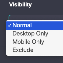
Carrd has three element settings to choose from. Choose exclude or mobile only or desktop only depending on your goals:
- Exclude completely hides your element. It will not be in the published page.
- Desktop only hides an element on mobile devices. It will still be present on desktop but not visible to the visitor.
- Mobile only hides an element for visitors on desktop devices with larger screens. It will still be present in the page but invisible.
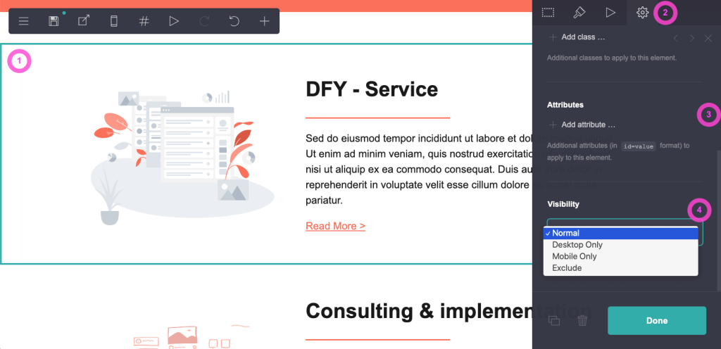
These are the simple steps:
- Select your element (so it has this blueish border)
- Go to settings (cog icon)
- Scroll down to visibility
- Choose exclude to hide or mobile/desktop for responsive visibility and invisibility
Hidden element example
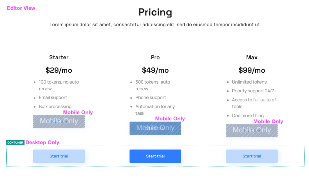
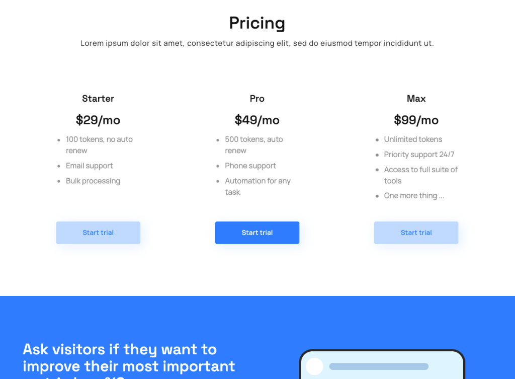
We have used this technique to properly align buttons under the pricing table in this SaaS landing page template. The buttons exist twice. Once for desktop in a separate container so they are nicely aligned, no matter how long the individual plan columns are. And once for mobile only so they show below each plans description when the three columns are stacked.
Hide element – carrd editor view
Hidden element – Mobile view
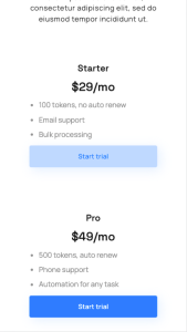
Hidden element – Desktop view
Free Carrd tutorial
Find more tips like this in our Carrd video tutorial. We have 16 lessons full of know how around how to build website in Carrd. You’ll learn about padding and margins, headers and footers, how to create multiple pages and much more. Take the course, you won’t regret it.
Carrd templates
Website templates save you hours of designing that you can spend on building your business. Carrd co templates are no different. And we offer the largest collection of professional Carrd templates you’ll find anywhere.
Check out our Carrd templates.
